Wednesday, December 24, 2008

MERRY XMAS!

hi all!

to the three people who actually
read this, have a merry christmas!

Thursday, December 11, 2008

blue redux part deux

more refined version of the face and other details. i'd like the final to feel like lithographs posters from the french belle epoch. right now, i have even less free time than usual, but this is always fun to come back to. i like the flavor of the colors, but not entirely sold on them...


Friday, September 19, 2008

slightly less-older friends

kalidah, monsters from "oz". i drew them up a while ago, but once again i returned to color them as portfolio pieces...
i really do love coloring up more of my work!

Wednesday, September 17, 2008

old friends

did these for the toybiz HP pitch a million years ago... always liked them, so i colored them up for my games portfolio. my record of zero responses from any game or animation studio remains intact. yay!

Sunday, September 7, 2008

sneaky peek

howdy!

it's funny how interesting things can look out of context. i'm often in the middle of moving layers or playing with levels on a file and i do something that is wrong and unusable, but still pretty. things that are never seen by anyone looking at the final art. so here are some bits from a digital painting that i like on their own...


Monday, September 1, 2008

yay me!

this is part of a bigger picture, but it's also
a bit from my civilization thing blah blah...


ALSO, i don't think the details have been made
public yet, but i have some exciting news! yay!
i will be working on a comic for DC, along the
lines of "batman: black and white" and "52". as
soon as it's okay, i will blab all.

yay! again.

Sunday, August 31, 2008

Monday, August 25, 2008

something munchier


for "oz". i painted several houses separately, now i'm doing the bkg. one trick with the oz scenes is that they obviously have to be vibrant, but i don't want them looking too candy-coated, especially since it will be hard enough to overcome the "cutesy" stigma of the movie.
something else i want to show is that oz is very much lived in. for example, the munchkins have been ruled by a wicked witch for years, and assuming their definition of "wicked witch" is more or less the same as mine, their lands must be in pretty roughe shape. so i wanted a balance between jewel-like beauty and a certain sense of neglect. the tinman's shack provides a similar opportunity, as does the logo on his jacket. these have little visual flourishes that both show how exotic oz is, and how comfortable its denizens have made themselves.

more later!

ps - each quarter of oz is associated with a certain race and color (and witch). hence, the eastern witch rules the munchkins in their blue houses, etc. oddly enough, the civilization in "the bones of kyres" has a cardinal-compass cosmology which is similar.

Thursday, August 21, 2008

eustace the happy fun-time killbot

military mecha, for the imaginary civilization thingie:


being a nerd, i've actually put ridiculously huge amounts of time into working out structural and functional junk, trying to redesign the wheel, i suppose. in my foolish youth, i would just design whatever looked cool; unfortunately, over the years i've become obsessed with trying to think beyond that, into the core needs and functions of machines i design. (or more precisely, first i try to think of what RESULTS would be best called for in a given situation, then work backwards towards the basic design that could achieve those results, then what sort of technology would be necessary to make the design workable.) which is why it has such scrawny and uncool bug legs, for example. fortunately, i don't have the energy to type it all out, which means you don't have to waste your time reading it!

because i'm all about you.


ps - no, it's name is not "eustace". that was a trick.

Monday, August 18, 2008

repaint

howdy!

in recent cleanups, i've found lots of old (and bad) art, including this hot little number. a painting for my college thesis, for some reason i made the cranium super-small. weird. anyway, this is a character from that world thingie. i used a photo of myself as the model, because i couldn't afford to pay anyone, and i can look at myself for reference anytime i want. (so you'd think i would know what my own, shiny-domed cranium would look like... sigh.)


anyway, the basic colors, especially for the face, were nice, but i never liked the background or costume. so i slapped a little color over the face, a quick (45min) bit of relaxation. i love to paint, i wish i had more time...


(i wasn't trying to make the new one look particularly like me, and i can assure you that i am much fatter, uglier, and balder than either pic.)

Thursday, August 14, 2008

minno samrin

more of the same... quick color sketch; idea for main page of kyres site, lettering that reflects (one of the various) "authentic" font style. also example of advertising/label art, for one of the essays. the creature is a minno samrin, a sort of spirit that sucks up negative energy and blows out good luck. (hence the coins he is also carrying.) this is what happens when your computer is taking forever to backup real "work" files. well, backup is done, back to my job!

Friday, August 8, 2008

empress blue redux

below i posted an art-nouveauish pic of "number one glory girl empress blue". i mentioned that this was a revised version of an older piece (which was itself based on sketches from college) i did for a drawingboard.org auction. here is the older version, with type inserted:


holy crap! digging up that image, i accidentally found this one, from my college thesis. yikes! in my defense, with both of these i was trying to suggest an art style different from modern illustration, but still... they are pretty terrible. that is why some of my newer pieces (like the new blue post below) have all the content, iconography, subject matter etc of the older work, but in a more familiar illustrative style.

it's depressing how bad both my painting and photoshop skills were. yeesh.


let the mockery begin!

Tuesday, August 5, 2008

lawn

saw this (more or less) this morning,
kinda' creeped me out. took about
15 minutes to "sketch" it. background
colors are all off, but i like the face
and especially the knees:

Monday, August 4, 2008

catching up...

oops!

just revisiting my old posts. i realized that,
not only have i rudely failed to reply to your
replies, but i also left out various pics and
comments in the posts themselves!

you'd think that fifth year of college would
have made me smarter...

anyhoo, thanks to everyone for posting! i
really appreciate your comments and support.
frankly, the past year has been very unsettling
for me, especially realizing how short i've fallen
of my own expectations (both professionally
and artistically). boo, hoo.

on the one hand, these little "projects" are a
life line for me, one the other hand, not having
the time (or not being smart enough to figure
out how to MAKE the time, whichever you prefer)
to finish my visual thoughts is frustrating. each
little thing is progressing in teeny steps, and
i'll keep posting them, but the desire to throw
out my entire current art life and start from
scratch is really overwhelming.

wow. i am garrulous AND whiny.

back to the point of this post... adding to a
few incomplete earlier posts:

in january, i posted sketches for my first
"assignment", the CD cover. i was considering
different final treatments for the basic drawing.
one is more fully painted, which will take a while.
another one was this very basic idea, basically
just the sketch, digitally jazzed up. i liked it
because the actual drawing is so interesting,
and this highlights it where a more fully painted
version might obscure it. then again, there's no
excuse why i shouldn't be able to work out some-
thing that sells both the raw drawing and more
realized color/painting treatment. i figure there
is always a solution... it's just the artists job to
figure it out!

so here's the 1st color version:


can't wait to get back to it!
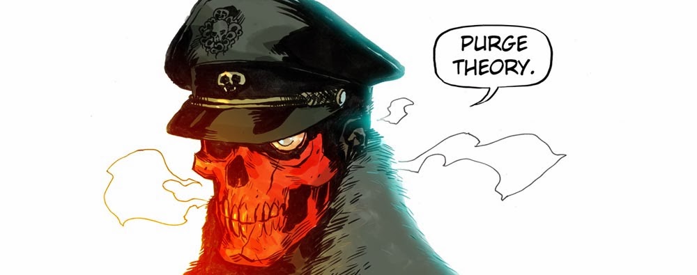
(not to mention that hulk pic, and the
kiss pic, and batman/catwoman, etc...)

also left out...

in march, i was trashing the whitney "modern art"
exhibit. (there were a few good pieces, but they
just highlighted the overall failure of the thing.)
i contrasted the whitney to the MoMA (Museum
of Modern Art).

one of the whitney pieces was several words spelled
out on the wall with lumps of what was presumably
meant to look like shit. literally. but they didn't look
like shit, they looked like lumps of brown play-dough,
which they probably were. i have no idea what the piece
was "about", i didn't see any explanatory blurb. which
is fine by me — it's one thing to have some blurb
explaining the emotional context of a work, or calling
out subtle nuances, that's fine. but if you need a written
crutch just to explain the point of shit names on the
wall, you should probably stop being a lazy and pre-
tentious goof.

MEANWHILE, BACK AT THE MOMA... there is a display
of a small, packaged can from the 1930s. the label is
in italian, but the placard translates the label as "100%
artist's shit". guess what the medium is? that's right...
can, paper label, and artist's shit. maybe you like it,
maybe you hate it, but you definitely have a reaction!
and (assuming you can read italian) the art is completely
self-explanatory — at least, when an artist proudly
packages and displays his own shit in a museum, you
can at least guess what he's saying... about art, about
artists, about museums, whatever.

so i think it is awesome.

Saturday, August 2, 2008

another sneak peek...

this is something i've been working on a long time.
so long that i don't even have the urge to write
something "witty" about how long it has been.

anyway, my college thesis was an series of illustrated
essays about a fictional civilization (even then, i'd been
working on it for a lon -- ah, you get the idea). ever
since then, i've been adding/revising to what is now
an impressive pile of crappy scribbles.

i had dreamed, like some jacob reclining on a stone
pillow, to greater things... perhaps some pretty art book?
or a fancy website? all dedicated to my self-indulgent
doodles. but the time has never come -- perhaps it never
will -- and enough is enough. so i will be piling a bunch
of this junk onto some site, in all of its undiluted and
undigested "glory".

here is a color doodle of an imperial bonds ad, one of
the illustrations for an essay about sex, consumerism,
social revolution and art in the "new empire" period of
my imaginary civilization. i'll post a link to my wonder
site... as soon as i've found/made one!

in my dream-life, i will have a chance to finish this and
a few similar pics, to make as prints. i don't really care
if anyone else buys them, i'd just love an excuse to
hang them on my wall...


(yes, this is a revised version of the oil painting i did
several years ago for a drawingboard.org fundraiser.
which was itself a revis -- ah, forget it.)

as always, click for a larger version.

kansas

here is a sneak peek at "the wizard of oz".
okay, it's a very small sneak peek. anyways,
i love landscape painting, i could do it all
day. well, almost all day... i'd probably want
to sleep on occasion.

i really like the chickens.


(click on it for a much bigger image)

Friday, July 25, 2008

hi all!

if you're reading this, then you are wondering why the hell i haven't posted in forever. or, you are not wondering anything, you found this site by accident, and you are thinking about what you what to eat for dinner. i recommend thai.

anyhoo... i'm in the middle of trying to get a job, and also finishing up some outstanding freelance work. so, i've been doing/drawing lots, just nothing i can post... and no time for chit chat. i'll try to change that, at least the last part, but we'll see what happens. i always have all sort of important things to say (or trite, unoriginal thoughts to share... honestly, it could go either way). unfortunately, i'm terrible at typing. so maybe i'll figure a way around that.

on the other hand, i actually do have a few new arts to share. you've probably come here from the drawingboard.org or the actioncartooning.com forum, so you've already seen these. but just in case...

1-batman and catwoman for friend.
2-a badger, for another friend. the badger
and his ghostly pals are from a back story
the ancient history of "the dare detectives".
i'd tell you about it, but who cares?
i don't!
3-tiger designs, initially inspired by "jungle
book", but evolving/devolving into designs
for another "DD" history back story. blah.
4-"peter and the wolf" designs for someone else.


EDIT: aaah... i figured i post that cartoony stuff elsewhere
all the time. you can see the tigers and wolf stuff here:
http://daredetectives.com/phpBB2/viewtopic.php?t=11809
http://daredetectives.com/phpBB2/viewtopic.php?t=11700

and while i'm at it, rejected designs for the new batman cartoon:
http://daredetectives.com/phpBB2/viewtopic.php?t=8931
(my favorite is killer croc, on the second page.)

instead, i posted some drawings of wonder woman. yay!
(where are you, sam hatmaker?)

Wednesday, March 12, 2008

hiatus

hi all!

thanks for the comments, or just peeping in. right
now, i'm in the middle of a career change, so not a
lot of time for doodling.

although i'm fired up to finish some of these and
start a few things that go in an entirely different
direction. we went to the whitney biennial last week,
which was half interesting and half retarded. i refuse
to believe that we were seeing the best of the best in
new american modern art. i can think of plenty of
projects turned in by my fellow students in college
that were more original, more provocative, and even
better crafted than some of that junk.

unfortunately, modern "modern" art is like anime or
musical skits on SNL -- lots of potential, and every
once in a while someone does a great job, but it's
usually a waste of time.
which is more obvious when you go to the MoMA and see
work by klee, miro, gaughan (sp?), picasso, and esp-
ecially after seeing their UNBELIEVABLE lucian freud
exhibit. lots of fun, and lots of ideas for me...
someday.

anyhoo... last week i did a little more of that hulk,
here it is in it's glory. also, you can see tons of
my illustrations and designs dumped here:


http://www.daredetectives.com/phpBB2/viewtopic.php?t=7740&sid=fdfe6e12f55eb0060c40f1ded16cdf76

http://www.daredetectives.com/phpBB2/viewtopic.php?t=7734&sid=ccee7ef593cc3f3cada557007560c994

http://www.daredetectives.com/phpBB2/viewtopic.php?t=7749&sid=98ee3e14bcbe96a8d3851cf32d063395

http://www.daredetectives.com/phpBB2/viewtopic.php?t=7746&sid=a6280445f74268536e7cfaf34cc12db2

http://www.daredetectives.com/phpBB2/viewtopic.php?t=7747&sid=ecfcdb898fb145955c8f5b77a4a027b4

http://www.daredetectives.com/phpBB2/viewtopic.php?t=7741&sid=07a8825f655f24c3e2abed75e4086c1f

http://www.daredetectives.com/phpBB2/viewtopic.php?t=7452&sid=0d94789cc7f909e32ca15196925d7cdf

http://www.daredetectives.com/phpBB2/viewtopic.php?t=7449&sid=253e72b3b36e2967fb6c5edb03a08aa4

http://www.daredetectives.com/phpBB2/viewtopic.php?t=3682&sid=685470f935152192d0cc81b4c42d0e90

a lot of it is old, some of it is new.

see you next time!
ben

Sunday, February 17, 2008

feeling antsy


took a half hour or so out of the evening.
don't know when if ever i'll have the lux
of finishing it, other things to finish first.

as always.

Tuesday, February 12, 2008

project #1 - genesis again


back from atlanta, more pencils for the cd cover.
the hanging fleece is where band and title info would go. other graphics would go into various word balloons, a xxx sign behind the slipperman, etc. the tag behind rael is RI/AK for "rael imperial aerosol kid".

an interesting exercise and stress reliever. we'll see where it goes from here...

Friday, February 8, 2008

what he said

lots of work and an unexpected trip, not much time for art or posting. i wanted to blab about my favorite literary approach, reconstructivism. you've probably never heard of it, since i just made it up one day -- the name, not the concept. in fact, i'm certain some smart person has already written up volumes about it, and given it a suitably brilliant moniker. but i choose to live in blissful ignorance.

i'll just say here that reconstructivism is, unsurprisingly, a counterpoint to deconstructivism. unfortunately, it is often satirical, and is mistaken for satire or comedy, so i don't think that people are aware of it as a particular and deliberate mode of expression.

if you're still reading (and i applaud/berate your attentiveness), my literary hero is the late author donald barthelme. since this is supposed to be a brief haha post, i'll hold off on the details, and just say here that his final book "the king" is practically a reconstructivist manifesto.


"the purpose of satire (it has been rightly said) is to strip off the veneer of comforting illusion and cozy half-truth. and our job, as i see it, is to put it back again".

- michael flanders

Saturday, February 2, 2008

exercise #2 - kiss

two more exercises to add...

11 - a kiss. if there is something more hard to
draw, i don't know what it is.
12 - punched in the face - who wouldn't want
to to take a stab at drawing this?

anyway, exercise #2 (i warned you they might be in a different order). the kiss:


not sure that i love any of these, but they are a start. no particular reason why it's superman and wonderwoman, although i do have dc on the brain this weekend. i'll be doing more!

ps - some of yous guys might want to try these, too. just to make your lives more difficult!

Tuesday, January 29, 2008

exercise and project list

that last post was intended as my first exercise, painting skin. i've drawn up a list of additional exercises that target weaknesses in my conceptualization, technical skill, etc. i may or may not tackle them in this order:

1 - painting skin (which i will come back to later)
2 - collage (various types, including a juxtaposition
of disparate elements in a single drawing, and
the more typical "ransom note" look)
3 - cloth
4 - "soft" rendering (classical or airbrush rendering,
as opposed to the "splotch" rendering of jimmy)
5 - white on white
6 - fully rendered, photo-realistic animal
7 - incorporating graphic elements, borders, type
(my so-far failure here is embarassing,
since some of my greatest influences in-
clude art nouveau and medieval manuscripts,
which heavily intersperse art and design
elements. not to mention influences like
russian agitprop posters, chris ware, and
great books i have on thai graphic design
and old chinese firecracker graphics)
8 - black & white drawing on brown paper (it
sounds stupid, but i've wanted to do this
since my clooege days, can't understand why
i never got around to it)
9 - building up a sketch with blue & red pencils,
before finishing with black pencil or graphite
(again, i always see animators do this and i love
it, so here it comes!)
10 - monochrome tint, and/or autochrome look
(i love autochromes, too, always looking for
an excuse to try something and here's my
excuse. if you're unfamiliar with autochromes:
http://www.iphotocentral.com/showcase/showcase_view.php/62/1/0

there are a few more, but this is enough to be getting on, for now.

there are also projects. projects are explicitly finished art, and the hows and whys are secondary to the overall success of the piece. several of these are assignments i was given in college. i ether particularly enjoyed them, or horribly failed them (or both), and it seemed a good idea to revisit them:

1 - album cover
2 - book cover
3 - four elements
4 - tarot card
5 - dream
6 - sports (i hate drawing anything
sports related, so this seemed a
great way to kick myself in the teeth)
7 - editorial (i had a very narrow and
unsuccessful grasp on the full range
of crazy things this project provdes
when i was in college... i thought
editorial = caricature of newt gingich.
not this time, baby!)

of course, being the lazy and/or enterprising fellow that i am, some exercises and projects will overlap. for example, i might do an editorial about the evils of black market cloth smuggling, all drawn in black and white on brown paper. woohoo!

anyhoo...

here is an initial sketch for project#1, cd cover. in college, i chose "the lamb lies down on broadway", which is one of the albums that most influenced my art, in addition to being an incredibly bizarre and art-inducing album. (by crazy old-school genesis, in case i forgot to mention that part.)
my college pic (which is mercifully awol) was all right conceptually -- a white face, eyes wideopen and all manner of serpents, flies, butterflies, salamanders, and roots pouring out of the mouth. but looking back, i don't think i attempted to draw the face in any particular vein; it was not structured or rendered realistically, it was not graphically flattened, or scratchily abstracted, or anything else worthwhile. it was just there. ditto for the flora and fauna.
so i decided to revisit this creepy concept album, putting a little more pep in my composition, and trying to incorporate more of the countless crazy elements of the story.


on a nerd note: since i am my own client, i took certain liberties. 1) the album was released, and set, in 1974, but since the specific date is subordinate to the timeless otherworld which our hero rael wanders, i modernized everything. i'm not trying create a retro vibe or historical romance or the like, so i don't want to distract viewers with unecessary specificity. 2) the hero rael is a kid, but since he has sex with various characters and creatures in the story, he should probably look older. but i wanted to emphasize his vulnerabity and unformed condition. 3) upside-down lilywhite lilith is, in fact, supposed to be a middle-aged woman. too bad that's not in the songs, and i only read it in a recent interview, after i started the sketch. i like her as is, and since i'm the client, i've decided to sign off on my own decision.

i love the raven, but i'm not sold on his placement in the grand scheme. i'm also planning on working in various type elements, as well as graffiti of some sort.

Sunday, January 13, 2008

TIME TO PURGE!

it's been a crazy winter for me, crazier than my usual craziness. among other things, i've been reflecting a lot on my life and career (such as it is).

one of the things that really bothers me is how rarely i've taken advantage of opportunities in my life, how many chances for this or that i've thrown away for one reason or another. this is true of my life in general, but you don't need to hear about that. it applies even more directly to my art.

i'm not stupid, i'm perfectly aware that i am an above-average cartooninst. but the fact remains that, through a variety of projects for all sorts of clients, (most of whom gave me wide creative latitude), i've rarely measured up to my artistic potential. anyone who's seen my sketchbooks knows that they are far better than any of my books or covers. but sketches only show the potential of art. hearing that you have "lots of potential" from your fourth-grade art teacher is great, but at the age of 34, i feel that i should have realized that potential by now!

looking back at the work i did in high school and college, i was much more adventurous, mixing sculpture and graphics and all sorts of other fun things. the results were usually dreadful, especially since i was very technically limited in painting, but at least it was interesting. years of working on very specific projects like "dare!" has definitely led my down a literal path.

i've not only abandoned ideas and techniques that i once used, i've also abandoned -- or at least failed to incorporate -- some of my most powerful influences, probably because they didn't directly apply to the cartoon work at hand. while eyvind earle and don bluth are fantastic, i've never followed up on influences like matt mahurin, sue coe, ben shahn, or modigliani, not to mention russian propaganda posters, japanese woodblock prints, nouveau posters, or figure painters like lucian freud. i've also abandoned conceptual work, everything i do is either character design or scene illustration -- the most unconventional composition i've done in years is the cover to JLU #4... which certainly isn't saying much!

so in my haha spare time, i'm trying to reclaim a bit of artistic sanity by pushing myself to try (or retry) things i should have done long ago. i have made up a list of specific study assignments and projects i will attempt over the next year. hopefully i can build up a portfolio of new art that appeals to a broader range of artistic demands (and even push my "cartoony" work much further), but if nothing else, it will be a challenge.

and who doesn't like a challenge?


anyway, here is my first study, "skin". now there are 3 ways to paint a person: concentrate on the light source and ambience, as the impressionists did, focus on structure by using light/dark and cool/warm to "carve out" the figure, and luminence --
actually concentrating on the skin itself, with its translucence, blotches etc. of course, you can use all 3 approaches in a single painting, but in all things there is an order, so one of them has to dominate. i usually concentrate on light (which is how i was taught at college), but for a decade i've been jealous of the luminous skin painted by masters like lucian freud. so this was a first attempt at luminous skin, using an old, semi-"realistic" sketch. no filters or brush tricks, just a PSD paintbrush, set alternately at 33%, 66%, or 100% opacity:


(as always, download them for the best colors.)


there are a few more skin studies i would like to tackle, but since i have very limited time, i will probably take a stab at some other studies first. but wait...

i liked how the painting turned out, it seemed a waste not to do anything with it. so i decided to turn it into a more fully developed illustration, inspired by the title that originally popped into my head: "jimmy nosferatu, last of the undead tattoo kings".

it gave me a chance to incorporate some of my old influences and approaches into a freud-based figure painting: tattoos, of course, have always been a part of my work, even maria sports tats! although (like everything else) they usually appear more as parts of a character design, not as part of an actual illustration. and i'm no stranger to traditional and modern japanese graphics, having fed on both as a kid. (although i obviously didn't kill myself trying to replicate an exact style -- why do what anyone could do with a little photo reference?) i also had fun playing with off-registering the graphics, a trick i employed all the time in college, using -- gasp!!! -- xerox copies and tape. and the turquoise is compliments of mughal art, where it (and mint green) are always used to great effect to highlight forms. so...